Simply Benefits
UX Design, UI Design, Product Design
Introduction
I started full-time as a UX Design Specialist at Simply Benefits in May 2021 after completing a one-year internship. I was the sole designer on the team and in charge of the design of all products from start to finish. The skills I've learned in this role are invaluable; I've become confident in my ability to lead projects, make important product decisions, and deliver polished UI designs.
Role
UX Design Specialist, Product Design, UX/UI Design
Timeline
April 2021 - April 2022
Mobile App Designs
One of the larger projects I worked on at Simply Benefits was a complete overhaul of the Mobile App. I was the lead designer and in charge of research, ideation, and UX/UI.
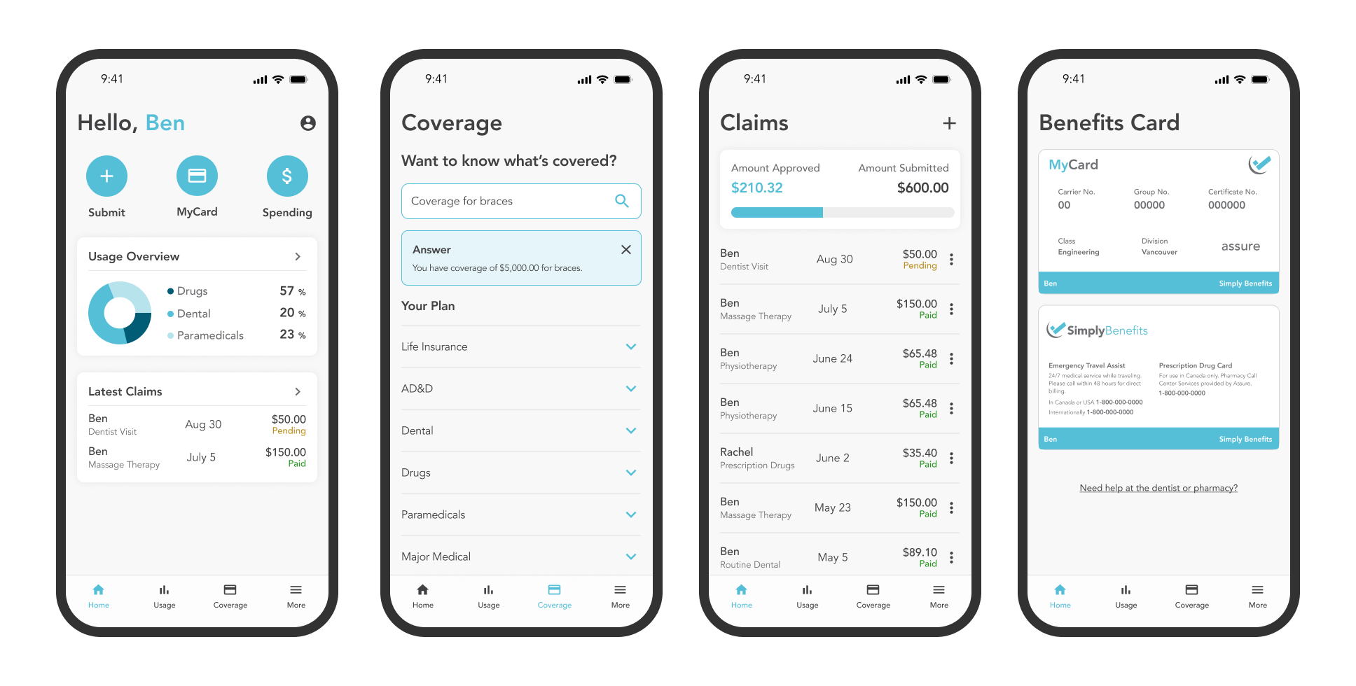
The app is an extremely important part of the member experience. Users can submit claims, view usage, look up their coverage, and more.
It had been a year or two since the app had any updates or improvements.
Goals
I started by defining several goals for the project.
Since the redesign was motivated mainly by improving the experience for users, I did some research on how those improvements could be made.
My research centered around finding out which features were most used by members and where users were spending the most time in the app.
Goal 1: Decrease the time it takes to submit a claim.
Goal 2: Help members better understand their coverage.
Goal 3: Clearly communicate members' usage and remaining amounts.
Goal 4: Improve and modernize the outdated UI.
Solutions
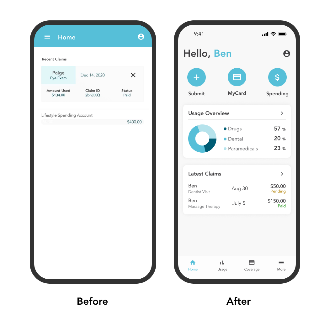
Starting with the Dashboard/Homepage, I wanted users to be immediately presented with information that they would otherwise go looking for.
Users can see their Latest Claims and Recent Usage, as well as quickly submit a claim by tapping the plus icon.
I also designed usage bars for the Claims and Spending Account Pages to show users how much they've spent and how much they have left.
Pictured here is a before and after of the home screen.


Feedback/Success
After the designs were launched we saw a large increase in app downloads. Members who had never used the app before were encouraged to download it, and existing app users were excited to update.
Our customer success team also received a lot of great feedback about the new designs.
I loved this project. Leading a redesign of an app so early in my career was intimidating but rewarding. I couldn't be happier with the results.
Desktop Portal Designs
In addition to the mobile app, Simply Benefits has three desktop web applications for three different customers and users; Advisors, Employers, and Employees.
As the design lead, I was in charge of maintenance, optimizations, and new feature development of these web applications.
The following designs are from the larger projects I worked on.
Optional Benefits
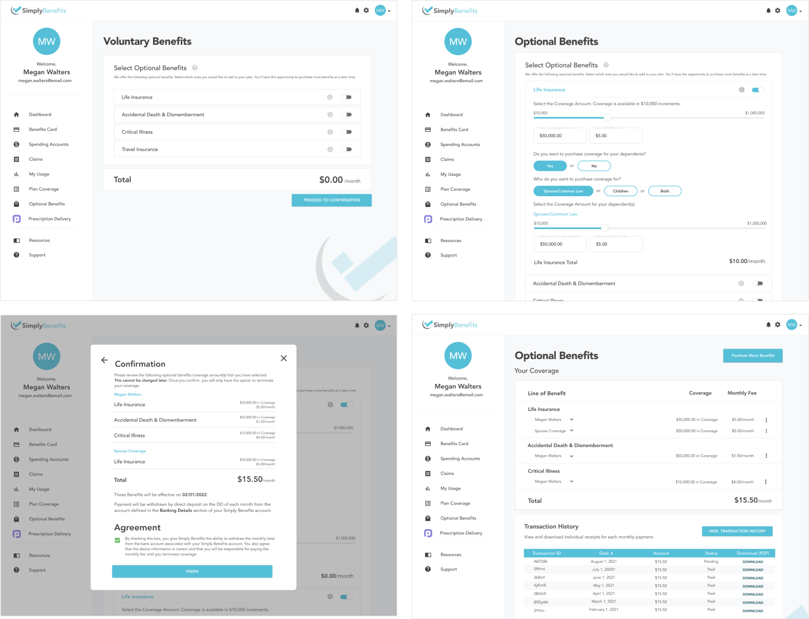
Optional benefits are 100% digital flexible add-on benefits for employees. Employees can purchase benefits individually which both improves their insurance experience and provides a new income stream for the company.
I designed this feature from start to finish, starting with research and wireframes. After polishing the UI, I tested the prototype on different users to improve the flow.
This feature is still in development and is expected to launch in late 2022.
Digital Advisor Quoting
One of the most impressive Simply Benefits features for advisors is the digital quoting tool that allows them to quote groups 100% digitally. The industry standard turnaround time for quotes is about 4-6 weeks, and this feature takes that time down to about 5 days.
The old version of this feature was outdated, confusing, and clunky. It didn't have a clear step-by-step process, and as a result, it wasn't being used.
I helped reorganize the back-end structure and flow and was in charge of designing the UI to go along with it. The updated UI is clear, concise, and clean. Since it has been launched, we've seen an increase in digital quote creation.
Web Design
Simply Benefits Website
During my time at Simply Benefits, I worked with the Brand and Marketing Manager to redesign the public site.
We worked together to highlight our brand mission with descriptive visuals and a simple layout.
This is a sample of the Homepage that we designed. In total, we designed a total of 6 pages.
Once the redesign was finished, I was in charge of the front-end development using React.js.
The redesign of the website decreased the bounce rate by 8% and increased session length by 12%.


Blog Redesign
As a small side project, I was in charge of redesigning and improving the User Experience for our Blog.
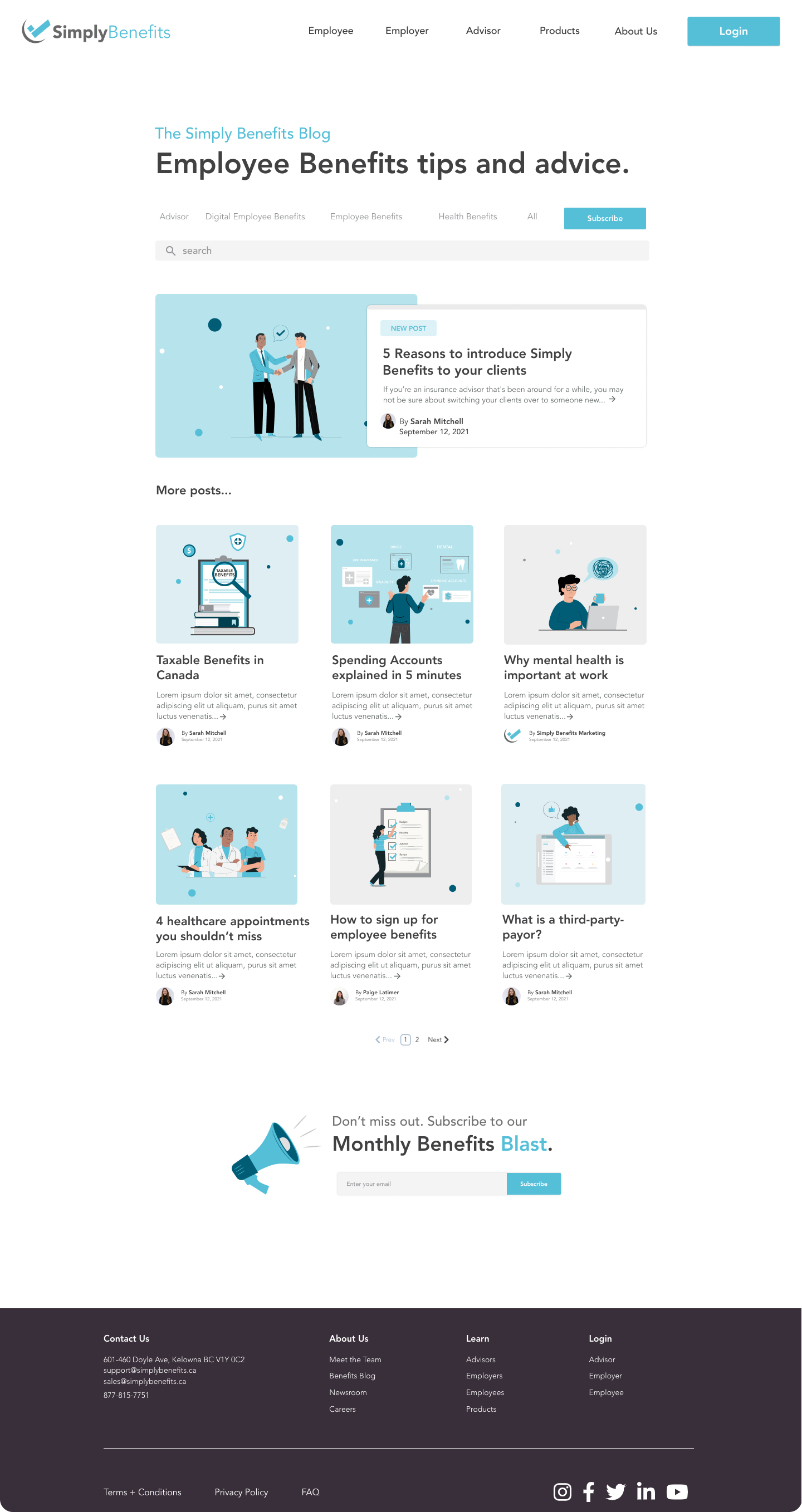
The previous iteration of the blog had various design issues. Most notably, though, was that it was not clear which blog was the most recent, and there was no way to search or filter content.
This is the Homepage of the blog I designed. I added filter tags so users can find related content and a search bar. I also cleaned up the UI and highlighted the most recent blog post.
After the design was finished, I also did the front-end development based on my designs using HTML, CSS, and HubL. See it in action here.
